5 posts tagged with "keycloakify"

View All Tags

Customizing Keycloak Themes with Keycloakify: A Modern Approach

· 4 min read

Keycloak is a powerful Open Source Identity and Access Management (IAM) solution widely adopted by organizations and companies. However, customizing its theme can be challenging due to limited documentation and the use of FreeMarker, an older templating technology that lacks modern developer-friendly features. Enter Keycloakify, a one-stop solution for customizing Keycloak themes using modern web technologies like React, TypeScript, Tailwind CSS, and Vite. This article explores how Keycloakify simplifies Keycloak theme customization and why it’s the best choice for developers looking to modernize their Keycloak UI.


Why Customize Keycloak Themes?​

Keycloak is highly customizable, but its default UI may not align with your organization's branding or design requirements. Customizing the theme allows you to:

  • Add your logo and branding elements.
  • Align the UI with your application’s design system.
  • Improve user experience with modern, responsive designs.
  • Add custom functionality or workflows.

However, Keycloak’s reliance on FreeMarker for theming makes customization cumbersome. FreeMarker lacks the flexibility and developer experience offered by modern front-end frameworks like React.


What is Keycloakify?​

Keycloakify is a toolchain designed to simplify Keycloak theme customization. It abstracts the complexities of FreeMarker and provides a modern development workflow using:

  • React: For building dynamic, component-based UIs.
  • TypeScript: For type safety and better developer experience.
  • Tailwind CSS: For utility-first, responsive styling.
  • Vite: For fast development and bundling.

Keycloakify acts as a lightweight middleware layer, allowing you to customize Keycloak’s UI while maintaining compatibility with its backend services. It supports all Keycloak theme types (Login, Registration, Account, etc.) and ensures seamless integration with the latest Keycloak versions.


Why Keycloakify is the Best Solution​

1. Modern Tech Stack​

Keycloakify replaces FreeMarker with React, enabling developers to use modern tools like Vite, Tailwind CSS, and TypeScript. This makes the development process faster, more efficient, and enjoyable.

2. Active Maintenance​

Keycloakify is actively maintained and keeps up with the latest Keycloak releases. This ensures compatibility and access to new features.

3. End-to-End Toolchain​

Keycloakify provides a complete development workflow, from local development to integration testing with Keycloak running in Docker. This eliminates the need for manual setup and reduces friction.

4. Abstraction Layer​

Keycloakify abstracts the communication between the front-end and Keycloak’s backend, ensuring that your customizations don’t break when Keycloak’s backend changes.


My Experience with Keycloakify​

I wanted to customize Keycloak to align with my organization’s branding and add new Service Providers. My tech stack included Keycloakify, Tailwind CSS, and React. Here’s how I approached the customization:

Challenges Faced​

  • PatternFly Dependency: Keycloak’s default UI components are built on PatternFly, which is not very customization-friendly.
  • Component Rewriting: I decided to rewrite Keycloak’s UI components using plain React and Tailwind CSS, modularizing them for reusability.

Work Done​

Here’s a glimpse of the before-and-after results:

Login Page​

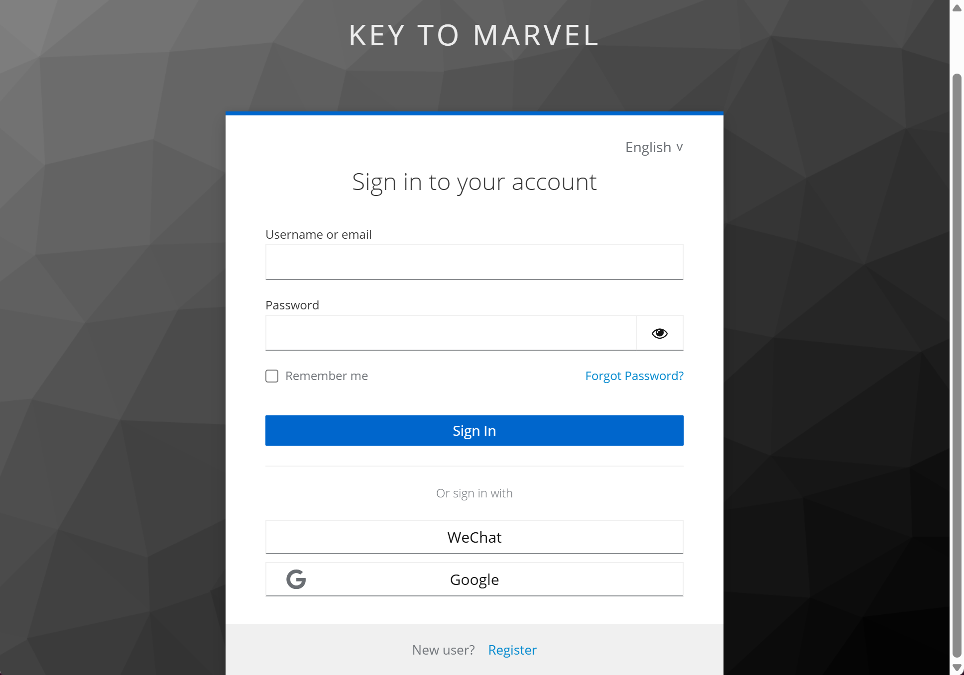
  • Before: Default Keycloak login form with PatternFly styling. Login-before
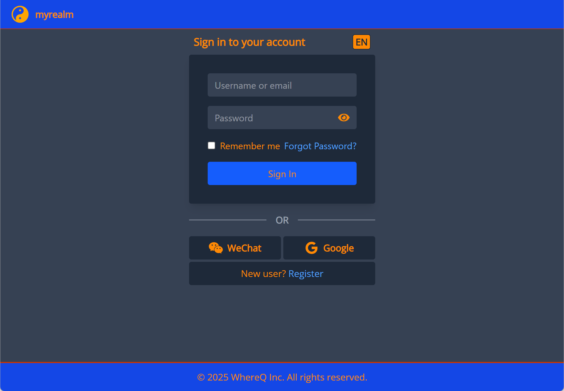
  • After: Custom login form with Tailwind CSS, aligned with our branding. Login-after
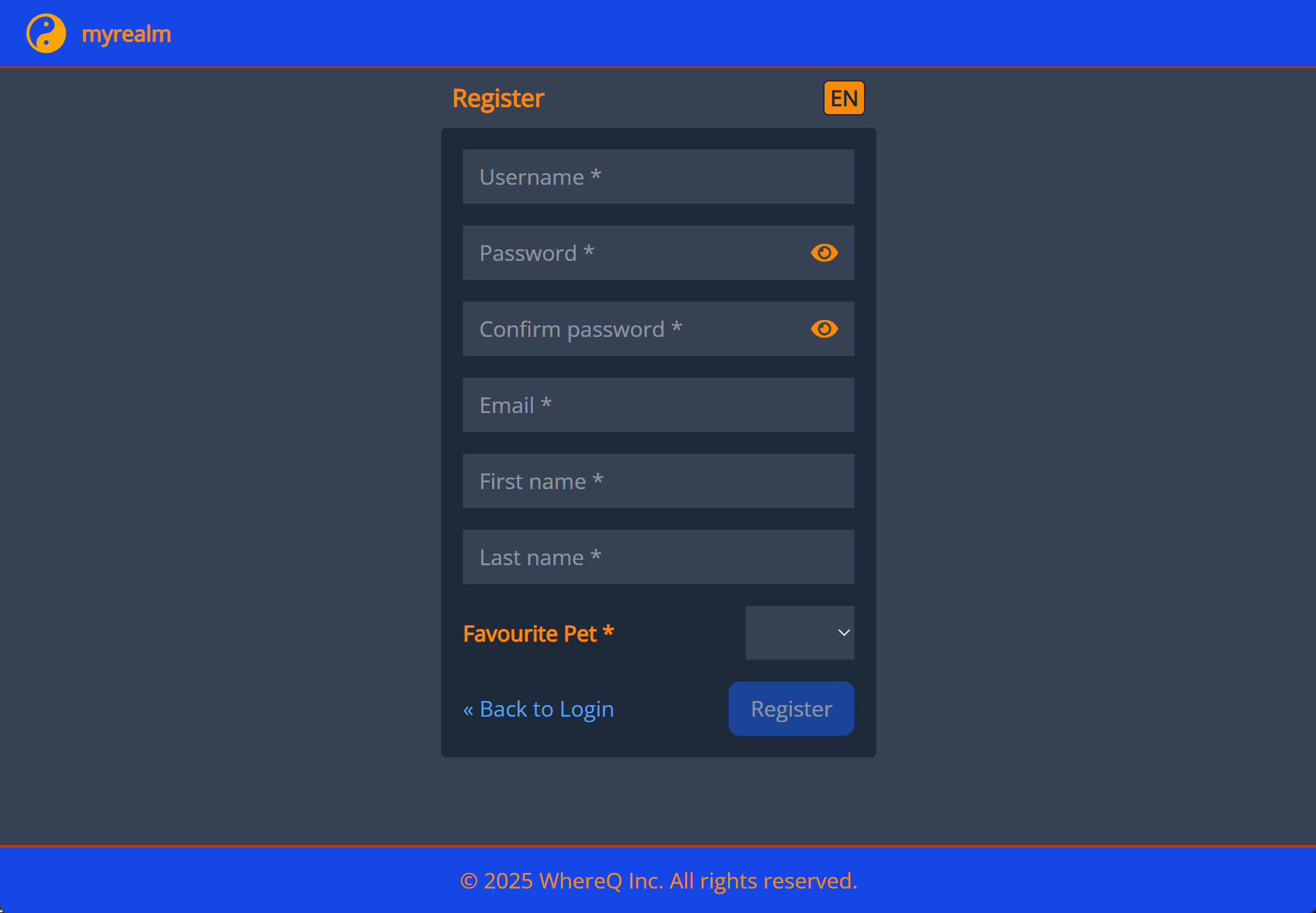
Registration Page​

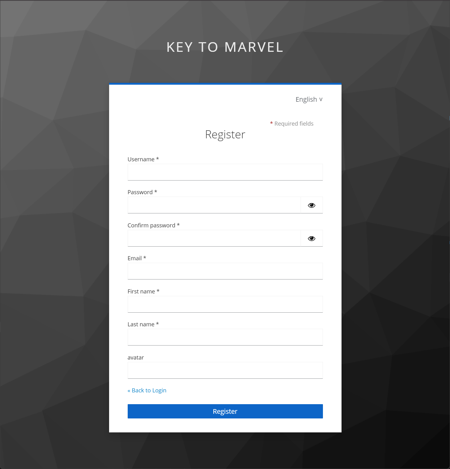
  • Before: Standard Keycloak registration form. Register-before
  • After: Modern, responsive registration form with custom fields and styling. Register-before
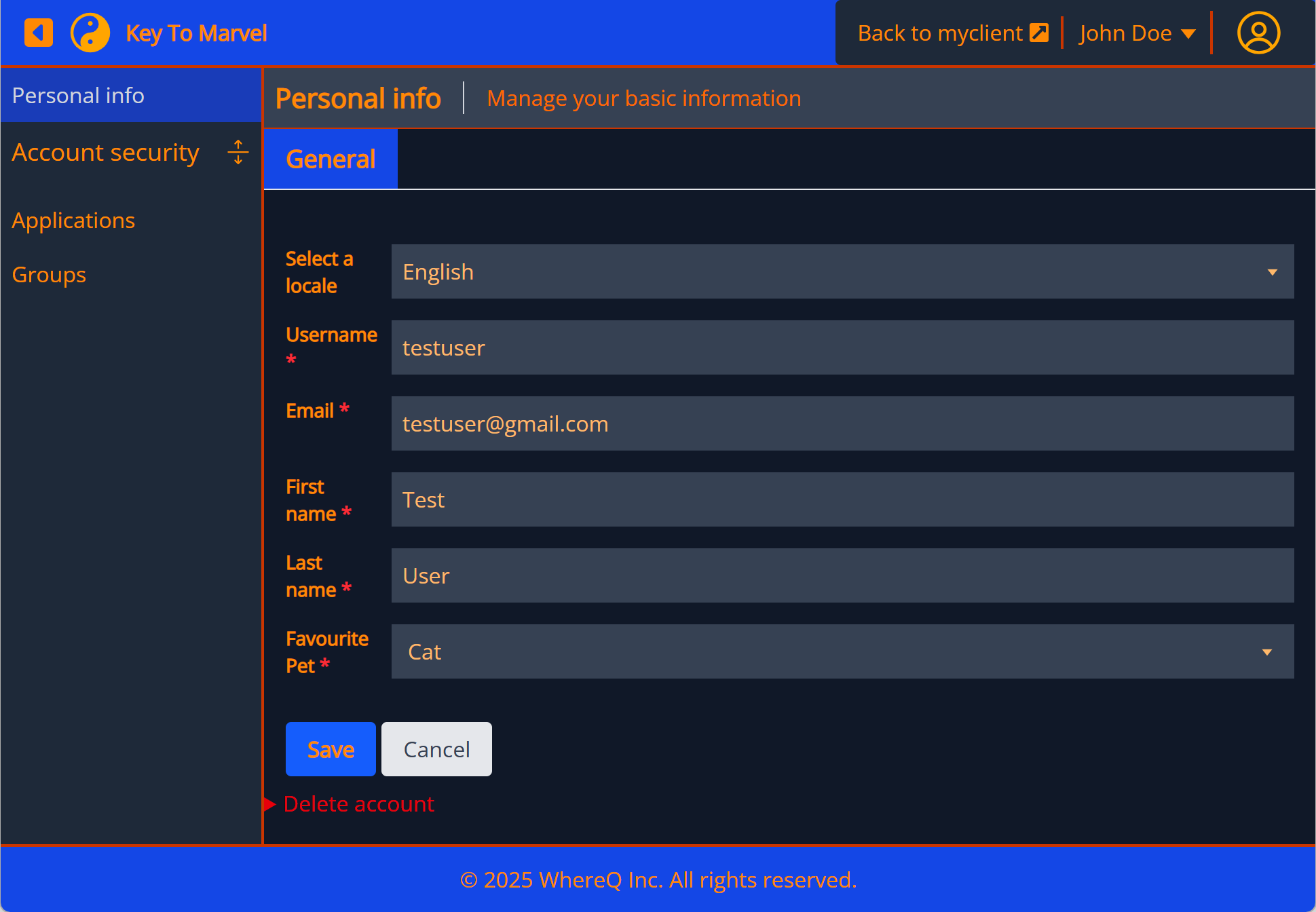
Account (User Profile) Page​

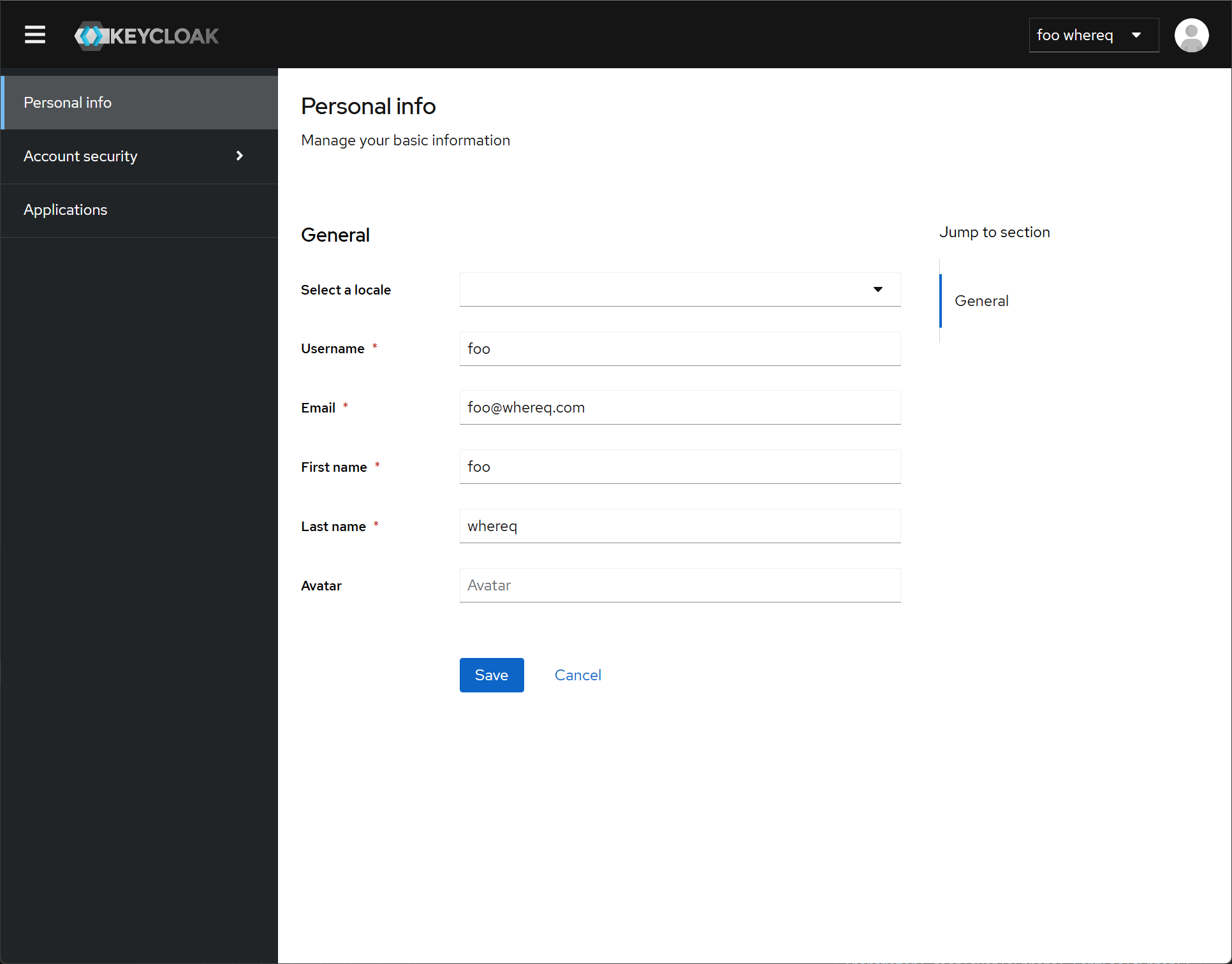
  • Before: Basic user profile interface. Account User Profile-before
  • After: Enhanced profile page with improved UX and branding. Account User Profile-after
Why Not Build a Custom Front-End from Scratch?​

While it’s technically possible to build a custom front-end and communicate with Keycloak via its RESTful API, this approach has significant drawbacks:

  1. Lack of Documentation: Keycloak’s front-end fields and requirements are not well-documented. You’d need to reverse-engineer the UI or inspect the runtime to understand the required fields.
  2. Dynamic Requirements: Keycloak’s backend can dynamically change the required fields (e.g., switching between username and email for login). A hardcoded front-end would break if these requirements change.
  3. Maintenance Overhead: Keeping a custom front-end in sync with Keycloak’s backend updates would require significant effort.

Keycloakify solves these problems by encapsulating the communication logic and providing a stable interface for customization.


References​

How the PersonalInfo Form Rendered --- KeyCloakify

· 13 min read

How the Form is Rendered​

  1. Component Structure:
    • The UserProfileFields component is the main entry point, receiving props like t (translation function), form (React Hook Form instance), userProfileMetadata (attribute metadata), and others.
    • It renders a ScrollForm component, which takes a sections prop to display grouped form fields.

  1. Grouping Attributes:
    • Logic: Inside UserProfileFields, groupsWithAttributes is computed using useMemo:
      • If userProfileMetadata.attributes is empty, it returns an empty array.
      • Filters attributes based on hideReadOnly (excludes read-only fields if true).
      • Groups attributes by their group property, including an "ungrouped" category ({ name: undefined }) for attributes without a group.
      • Result: An array of GroupWithAttributes objects, each containing a group and its attributes.
    • Outcome: Only groups with attributes are rendered (filtered by .filter((group) => group.attributes.length > 0)).

  1. Rendering Sections:
    • ScrollForm: The ScrollForm component receives sections, where each section is an object with:
      • title: Derived from group.displayHeader or group.name, falling back to t("general").
      • panel: A <div className="space-y-4"> containing:
        • Optional group description (<p> with pb-6 text-gray-700) if group.displayDescription exists.
        • A list of FormField components, one per attribute in the group.
    • Rendering: ScrollForm likely renders these sections as collapsible or navigable panels (exact behavior depends on ScrollForm implementation, not shown here).

  1. FormField Rendering:
    • Logic: The FormField component determines how each attribute is rendered:
      • Special Case: If attribute.name === "locale", it renders a LocaleSelector.
      • General Case: Otherwise, it selects a component from FIELDS based on inputType:
        • inputType is computed by determineInputType (see below).
        • If attribute.multivalued or the value is multi-valued (isMultiValue), it defaults to MultiInputComponent.
        • Otherwise, it uses the mapped component from FIELDS (e.g., TextComponent for "text", SelectComponent for "select").
    • Component Props: Each FIELDS component receives t, form, inputType, attribute, and renderer.
    • Outcome: Each attribute is rendered as a form field (e.g., text input, select dropdown) based on its metadata.

  1. Field Types:
    • Mapping: The FIELDS object maps InputType to components:
      • "text", "html5-*" → TextComponent.
      • "textarea" → TextAreaComponent.
      • "select", "multiselect" → SelectComponent.
      • "select-radiobuttons", "multiselect-checkboxes" → OptionComponent.
      • "multi-input" → MultiInputComponent.
    • Dynamic Selection: determineInputType checks:
      • Root attributes (username, firstName, etc.) → "text".
      • attribute.annotations?.inputType if valid (e.g., "select", "textarea").
      • Default: "text".

  1. Visual Layout:
    • TailwindCSS: <div className="space-y-4"> adds vertical spacing between fields; <p className="pb-6 text-gray-700"> styles group descriptions.
    • Result: A scrollable form with sections, each containing a group title, optional description, and a list of input fields.

1. Form Rendering​

The UserProfileFields component is responsible for rendering the form. Here's how it works:

Step 1: Group Attributes​

  • The userProfileMetadata object contains metadata about the user profile, including attributes and groups.
  • The groupsWithAttributes array is created by grouping attributes based on their group property. If an attribute doesn't belong to any group, it's placed in a default group.
const groupsWithAttributes = useMemo(() => {
if (!userProfileMetadata.attributes) {
return [];
}

const attributes = hideReadOnly
? userProfileMetadata.attributes.filter(({ readOnly }) => !readOnly)
: userProfileMetadata.attributes;

return [
{ name: undefined }, // Default group for attributes without a group
...(userProfileMetadata.groups ?? []),
].map<GroupWithAttributes>((group) => ({
group,
attributes: attributes.filter(
(attribute) => attribute.group === group.name,
),
}));
}, [hideReadOnly, userProfileMetadata.groups, userProfileMetadata.attributes]);

Step 2: Render the Form​

  • The ScrollForm component is used to render the form sections. Each section corresponds to a group of attributes.
  • For each group, the title is derived from the group's displayHeader or a fallback (e.g., "general").
  • The panel contains the form fields for the group's attributes.
return (
<ScrollForm
label={t("jumpToSection")}
sections={groupsWithAttributes
.filter((group) => group.attributes.length > 0)
.map(({ group, attributes }) => ({
title: label(t, group.displayHeader, group.name) || t("general"),
panel: (
<div className="space-y-4">
{group.displayDescription && (
<p className="pb-6 text-gray-700">
{label(t, group.displayDescription, "")}
</p>
)}
{attributes.map((attribute) => (
<FormField
key={attribute.name}
t={t}
form={form}
supportedLocales={supportedLocales}
currentLocale={currentLocale}
renderer={renderer}
attribute={attribute}
/>
))}
</div>
),
}))}
/>
);

How Field Values are Populated​

  1. Form State:
    • Source: The form prop is a UseFormReturn<UserFormFields> from React Hook Form, managing the form state.
    • Type: UserFormFields (from utils.ts) includes user properties (e.g., username, email) and an attributes object or array for custom fields.

  1. Value Retrieval:
    • Logic: In FormField, form.watch(fieldName(attribute.name)) retrieves the current value of each field:
      • fieldName (from utils.ts) transforms the attribute name:
        • Root attributes (username, firstName, etc.) → direct property (e.g., "username").
        • Custom attributes → prefixed with "attributes." and dots replaced with "🍺" (e.g., "attributes.my.field" → "attributes.my🍺field").
      • Result: value reflects the current form state for that attribute (e.g., "john.doe" for username, ["option1"] for a multivalued field).

  1. Initial Population:
    • Not Shown: The initial values aren’t set in this file. They’re likely passed to form via useForm({ defaultValues }) in a parent component (e.g., a user profile editor).
    • Assumption: defaultValues would match UserFormFields, populated from a UserRepresentation object (e.g., { username: "john.doe", attributes: { "custom.field": "value" } }).

  1. Dynamic Behavior:
    • Watching Values: form.watch ensures the rendered component reflects real-time updates (e.g., user typing in a TextComponent).
    • Multi-Valued Check: isMultiValue(value) determines if the value is an array with multiple items, influencing the choice of MultiInputComponent.

  1. Component Role:
    • Field Components: Each FIELDS component (e.g., TextComponent) uses form to register its input (via register, control, etc., not shown here) and display the value.
    • Example: For TextComponent, it might render <input {...form.register(fieldName(attribute.name))} value={value} />.

2. Field Rendering and Value Population​

The FormField component is responsible for rendering individual form fields and populating their values. Here's how it works:

Step 1: Determine the Input Type​

  • The inputType is determined based on the attribute's metadata. For example, if the attribute is multivalued, the multi-input type is used.
  • The determineInputType function checks the attribute's annotations.inputType or falls back to a default type (text).
const inputType = useMemo(() => determineInputType(attribute), [attribute]);

const determineInputType = (attribute: UserProfileAttributeMetadata): InputType => {
if (isRootAttribute(attribute.name)) {
return "text";
}

const inputType = attribute.annotations?.inputType;

if (isValidInputType(inputType)) {
return inputType;
}

return DEFAULT_INPUT_TYPE;
};

Step 2: Render the Field​

  • The Component variable holds the appropriate component for the field based on the inputType. For example, if the inputType is text, the TextComponent is used.
  • If the attribute is locale, the LocaleSelector component is used instead.
const Component =
attribute.multivalued ||
(isMultiValue(value) && attribute.annotations?.inputType === undefined)
? FIELDS["multi-input"]
: FIELDS[inputType];

if (attribute.name === "locale")
return (
<LocaleSelector
form={form}
supportedLocales={supportedLocales}
currentLocale={currentLocale}
t={t}
attribute={attribute}
/>
);

return (
<Component
t={t}
form={form}
inputType={inputType}
attribute={attribute}
renderer={renderer}
/>
);

Step 3: Populate Field Values​

  • The form.watch method from react-hook-form is used to watch the value of the field. This ensures that the field's value is always in sync with the form state.
  • The fieldName function generates the field name based on the attribute's name. For example, if the attribute is username, the field name is username. If the attribute is customAttribute, the field name is attributes.customAttribute.
const value = form.watch(
fieldName(attribute.name) as FieldPath<UserFormFields>,
);

3. Form State Management​

The react-hook-form library manages the form state. Here's how it works:

Step 1: Form Initialization​

  • The form object is passed down from the parent component. It contains methods like watch, setValue, and register for managing form state.

Step 2: Field Registration​

  • Each field component (e.g., TextComponent, SelectComponent) registers itself with the form using the register method. This allows react-hook-form to track the field's value and validation state.

Step 3: Value Updates​

  • When a user interacts with a field (e.g., types in a text input), the onChange event updates the form state via react-hook-form.

4. Utility Functions​

The utils.ts file contains utility functions that support form rendering and value population:

fieldName​

  • Generates the field name based on the attribute's name. For root attributes (e.g., username), the field name is the attribute name. For custom attributes, the field name is prefixed with attributes..
export const fieldName = (name?: string) =>
`${isRootAttribute(name) ? "" : "attributes."}${name?.replaceAll(
".",
"🍺",
)}` as FieldPath<UserFormFields>;

label​

  • Generates the label for a field based on the attribute's displayName or a fallback.
export const label = (
t: TFunction,
text: string | undefined,
fallback?: string,
prefix?: string,
) => {
const value = text || fallback;
const bundleKey = isBundleKey(value) ? unWrap(value!) : value;
const key = prefix ? `${prefix}.${bundleKey}` : bundleKey;
return t(key || "");
};

Summary​

  1. Form Rendering:

    • The UserProfileFields component groups attributes and renders them in sections using the ScrollForm component.
    • Each section contains fields rendered by the FormField component.
  2. Field Rendering:

    • The FormField component determines the input type and renders the appropriate field component (e.g., TextComponent, SelectComponent).
    • The LocaleSelector component is used for the locale attribute.
  3. Value Population:

    • The form.watch method from react-hook-form ensures that field values are always in sync with the form state.
    • The fieldName function generates the correct field name for each attribute.
  4. Form State Management:

    • The react-hook-form library manages the form state, including field registration, value updates, and validation.
  5. Utility Functions:

    • Functions like fieldName and label support form rendering and value population.

Reference:​

// src/keycloak-theme/shared/keycloak-ui-shared/user-profile/UserProfileFields.tsx
import {
UserProfileAttributeGroupMetadata,
UserProfileAttributeMetadata,
UserProfileMetadata,
} from "@keycloak/keycloak-admin-client/lib/defs/userProfileMetadata";
import { TFunction } from "i18next";
import { ReactNode, useMemo, type JSX } from "react";
import { FieldPath, UseFormReturn } from "react-hook-form";

import { ScrollForm } from "../scroll-form/ScrollForm";
import { LocaleSelector } from "./LocaleSelector";
import { MultiInputComponent } from "./MultiInputComponent";
import { OptionComponent } from "./OptionsComponent";
import { SelectComponent } from "./SelectComponent";
import { TextAreaComponent } from "./TextAreaComponent";
import { TextComponent } from "./TextComponent";
import { UserFormFields, fieldName, isRootAttribute, label } from "./utils";

export type UserProfileError = {
responseData: { errors?: { errorMessage: string }[] };
};

export type Options = {
options?: string[];
};

export type InputType =
| "text"
| "textarea"
| "select"
| "select-radiobuttons"
| "multiselect"
| "multiselect-checkboxes"
| "html5-email"
| "html5-tel"
| "html5-url"
| "html5-number"
| "html5-range"
| "html5-datetime-local"
| "html5-date"
| "html5-month"
| "html5-time"
| "multi-input";

export type UserProfileFieldProps = {
t: TFunction;
form: UseFormReturn<UserFormFields>;
inputType: InputType;
attribute: UserProfileAttributeMetadata;
renderer?: (attribute: UserProfileAttributeMetadata) => ReactNode;
};

export type OptionLabel = Record<string, string> | undefined;

export const FIELDS: {
[type in InputType]: (props: UserProfileFieldProps) => JSX.Element;
} = {
text: TextComponent,
textarea: TextAreaComponent,
select: SelectComponent,
"select-radiobuttons": OptionComponent,
multiselect: SelectComponent,
"multiselect-checkboxes": OptionComponent,
"html5-email": TextComponent,
"html5-tel": TextComponent,
"html5-url": TextComponent,
"html5-number": TextComponent,
"html5-range": TextComponent,
"html5-datetime-local": TextComponent,
"html5-date": TextComponent,
"html5-month": TextComponent,
"html5-time": TextComponent,
"multi-input": MultiInputComponent,
} as const;

export type UserProfileFieldsProps = {
t: TFunction;
form: UseFormReturn<UserFormFields>;
userProfileMetadata: UserProfileMetadata;
supportedLocales: string[];
currentLocale: string;
hideReadOnly?: boolean;
renderer?: (
attribute: UserProfileAttributeMetadata,
) => JSX.Element | undefined;
};

type GroupWithAttributes = {
group: UserProfileAttributeGroupMetadata;
attributes: UserProfileAttributeMetadata[];
};

export const UserProfileFields = ({
t,
form,
userProfileMetadata,
supportedLocales,
currentLocale,
hideReadOnly = false,
renderer,
}: UserProfileFieldsProps) => {
// Group attributes by group, for easier rendering.
const groupsWithAttributes = useMemo(() => {
// If there are no attributes, there is no need to group them.
if (!userProfileMetadata.attributes) {
return [];
}

// Hide read-only attributes if 'hideReadOnly' is enabled.
const attributes = hideReadOnly
? userProfileMetadata.attributes.filter(({ readOnly }) => !readOnly)
: userProfileMetadata.attributes;

return [
// Insert an empty group for attributes without a group.
{ name: undefined },
...(userProfileMetadata.groups ?? []),
].map<GroupWithAttributes>((group) => ({
group,
attributes: attributes.filter(
(attribute) => attribute.group === group.name,
),
}));
}, [
hideReadOnly,
userProfileMetadata.groups,
userProfileMetadata.attributes,
]);

if (groupsWithAttributes.length === 0) {
return null;
}

return (
<ScrollForm
label={t("jumpToSection")}
sections={groupsWithAttributes
.filter((group) => group.attributes.length > 0)
.map(({ group, attributes }) => ({
title: label(t, group.displayHeader, group.name) || t("general"),
panel: (
<div className="space-y-4"> {/* Replaced pf-v5-c-form with Tailwind CSS */}
{group.displayDescription && (
<p className="pb-6 text-gray-700"> {/* Replaced pf-v5-u-pb-lg with Tailwind CSS */}
{label(t, group.displayDescription, "")}
</p>
)}
{attributes.map((attribute) => (
<FormField
key={attribute.name}
t={t}
form={form}
supportedLocales={supportedLocales}
currentLocale={currentLocale}
renderer={renderer}
attribute={attribute}
/>
))}
</div>
),
}))}
/>
);
};

type FormFieldProps = {
t: TFunction;
form: UseFormReturn<UserFormFields>;
supportedLocales: string[];
currentLocale: string;
attribute: UserProfileAttributeMetadata;
renderer?: (
attribute: UserProfileAttributeMetadata,
) => JSX.Element | undefined;
};

const FormField = ({
t,
form,
renderer,
supportedLocales,
currentLocale,
attribute,
}: FormFieldProps) => {
const value = form.watch(
fieldName(attribute.name) as FieldPath<UserFormFields>,
);
const inputType = useMemo(() => determineInputType(attribute), [attribute]);

const Component =
attribute.multivalued ||
(isMultiValue(value) && attribute.annotations?.inputType === undefined)
? FIELDS["multi-input"]
: FIELDS[inputType];

if (attribute.name === "locale")
return (
<LocaleSelector
form={form}
supportedLocales={supportedLocales}
currentLocale={currentLocale}
t={t}
attribute={attribute}
/>
);
return (
<Component
t={t}
form={form}
inputType={inputType}
attribute={attribute}
renderer={renderer}
/>
);
};

const DEFAULT_INPUT_TYPE = "text" satisfies InputType;

function determineInputType(
attribute: UserProfileAttributeMetadata,
): InputType {
// Always treat the root attributes as a text field.
if (isRootAttribute(attribute.name)) {
return "text";
}

const inputType = attribute.annotations?.inputType;

// if we have an valid input type use that to render
if (isValidInputType(inputType)) {
return inputType;
}

// In all other cases use the default
return DEFAULT_INPUT_TYPE;
}

const isValidInputType = (value: unknown): value is InputType =>
typeof value === "string" && value in FIELDS;

const isMultiValue = (value: unknown): boolean =>
Array.isArray(value) && value.length > 1;
###

### src/keycloak-theme/shared/keycloak-ui-shared/user-profile/utils.ts
import { UserProfileAttributeMetadata } from "@keycloak/keycloak-admin-client/lib/defs/userProfileMetadata";
import UserRepresentation from "@keycloak/keycloak-admin-client/lib/defs/userRepresentation";
import { TFunction } from "i18next";
import { FieldPath } from "react-hook-form";

export type KeyValueType = { key: string; value: string };

export type UserFormFields = Omit<
UserRepresentation,
"attributes" | "userProfileMetadata"
> & {
attributes?: KeyValueType[] | Record<string, string | string[]>;
};

type FieldError = {
field: string;
errorMessage: string;
params?: string[];
};

type ErrorArray = { errors?: FieldError[] };

export type UserProfileError = {
responseData: ErrorArray | FieldError;
};

const isBundleKey = (displayName?: string) => displayName?.includes("${");
const unWrap = (key: string) => key.substring(2, key.length - 1);

export const label = (
t: TFunction,
text: string | undefined,
fallback?: string,
prefix?: string,
) => {
const value = text || fallback;
const bundleKey = isBundleKey(value) ? unWrap(value!) : value;
const key = prefix ? `${prefix}.${bundleKey}` : bundleKey;
return t(key || "");
};

export const labelAttribute = (
t: TFunction,
attribute: UserProfileAttributeMetadata,
) => label(t, attribute.displayName, attribute.name);

const ROOT_ATTRIBUTES = ["username", "firstName", "lastName", "email"];

export const isRootAttribute = (attr?: string) =>
attr && ROOT_ATTRIBUTES.includes(attr);

export const fieldName = (name?: string) =>
`${isRootAttribute(name) ? "" : "attributes."}${name?.replaceAll(
".",
"🍺",
)}` as FieldPath<UserFormFields>;

export const beerify = <T extends string>(name: T) =>
name.replaceAll(".", "🍺");

export const debeerify = <T extends string>(name: T) =>
name.replaceAll("🍺", ".");

export function setUserProfileServerError<T>(
error: UserProfileError,
setError: (field: keyof T, params: object) => void,
t: TFunction,
) {
(
((error.responseData as ErrorArray).errors !== undefined
? (error.responseData as ErrorArray).errors
: [error.responseData]) as FieldError[]
).forEach((e) => {
const params = Object.assign(
{},
e.params?.map((p) => (isBundleKey(p.toString()) ? t(unWrap(p)) : p)),
);
setError(fieldName(e.field) as keyof T, {
message: t(
isBundleKey(e.errorMessage) ? unWrap(e.errorMessage) : e.errorMessage,
{
...params,
defaultValue: e.errorMessage || e.field,
},
),
type: "server",
});
});
}

export function isRequiredAttribute({
required,
validators,
}: UserProfileAttributeMetadata): boolean {
// Check if required is true or if the validators include a validation that would make the attribute implicitly required.
return required || hasRequiredValidators(validators);
}

/**
* Checks whether the given validators include a validation that would make the attribute implicitly required.
*/
function hasRequiredValidators(
validators?: UserProfileAttributeMetadata["validators"],
): boolean {
// If we don't have any validators, the attribute is not required.
if (!validators) {
return false;
}

// If the 'length' validator is defined and has a minimal length greater than zero the attribute is implicitly required.
// We have to do a lot of defensive coding here, because we don't have type information for the validators.
if (
"length" in validators &&
"min" in validators.length &&
typeof validators.length.min === "number"
) {
return validators.length.min > 0;
}

return false;
}

export function isUserProfileError(error: unknown): error is UserProfileError {
// Check if the error is an object with a 'responseData' property.
if (
typeof error !== "object" ||
error === null ||
!("responseData" in error)
) {
return false;
}

const { responseData } = error;

if (isFieldError(responseData)) {
return true;
}

// Check if 'responseData' is an object with an 'errors' property that is an array.
if (
typeof responseData !== "object" ||
responseData === null ||
!("errors" in responseData) ||
!Array.isArray(responseData.errors)
) {
return false;
}

// Check if all errors are field errors.
return responseData.errors.every(isFieldError);
}

function isFieldError(error: unknown): error is FieldError {
// Check if the error is an object.
if (typeof error !== "object" || error === null) {
return false;
}

// Check if the error object has a 'field' property that is a string.
if (!("field" in error) || typeof error.field !== "string") {
return false;
}

// Check if the error object has an 'errorMessage' property that is a string.
if (!("errorMessage" in error) || typeof error.errorMessage !== "string") {
return false;
}

return true;
}

Customize kc-* css classes

· 3 min read

Summary of the Debugging Process, and Solutions about Customzing Template.tsx​

Customize kc-header-wrapper clss

In this case, the issue stemmed from the kc-header-wrapper class, which is part of Keycloak's original default theme (login.css). This class had predefined styles (e.g., padding, line-height, font-size, etc.) that were overriding the Tailwind CSS styles applied via inline classes in the React component. The kc- prefixed classes are part of Keycloak's default theme, and customizing them with Tailwind CSS can be challenging because Tailwind's utility classes are often overridden by these predefined styles.

Debugging Process:​

  1. Initial Observation:

    • The kc-header-wrapper was exceeding the height of its parent (kc-header), causing layout issues.
    • The h-full Tailwind class was not working as expected.
  2. Root Cause Identification:

    • The kc-header-wrapper class from Keycloak's login.css was overriding the Tailwind styles with its own padding, line-height, and other properties.
  3. Attempted Fixes:

    • Initially, Tailwind CSS classes like p-0, m-0, and h-full were used inline, but they were ineffective due to the higher specificity of the login.css styles.
    • The !important rule was considered to force override the styles.
  4. Final Solution:

    • A separate CSS file (template.css) was created to reset the problematic properties of #kc-header-wrapper using !important. This ensured that the styles from login.css were overridden.
    • The template.css file was imported into the Template.tsx component to apply the reset styles.

Final Solution Code:​

/* template.css */
#kc-header-wrapper {
padding: 0 !important;
margin: 0 !important;
line-height: normal !important;
font-size: inherit !important;
text-transform: none !important;
letter-spacing: normal !important;
white-space: normal !important;
}
{/* Header */}
<div id="kc-header" className={clsx(kcClsx("kcHeaderClass"), "bg-blue-700 border-b border-orange-700 h-[3.125rem] flex items-center px-4 fixed top-0 left-0 right-0 z-50 w-full")}>
<div id="kc-header-wrapper" className={clsx(kcClsx("kcHeaderWrapperClass"), "flex items-center h-full")}>
<img src={logoPngUrl} width={40} height={40} className="mr-2" />
{msg("loginTitleHtml", realm.displayNameHtml)}
</div>
</div>

Alternatives:​

  1. Inline Styles:

    • As a temporary debugging measure, inline styles can be used to override the login.css styles:
      <div id="kc-header-wrapper" style={{ padding: 0, margin: 0, lineHeight: "normal", fontSize: "inherit", textTransform: "none", letterSpacing: "normal", whiteSpace: "normal" }}>
      <img src={logoPngUrl} width={40} height={40} className="mr-2" />
      {msg("loginTitleHtml", realm.displayNameHtml)}
      </div>
  2. Tailwind !important Utility:

    • Tailwind CSS supports the !important utility (e.g., p-0!), but this may not always work due to specificity issues with Keycloak's default styles.
  3. Custom CSS File:

    • The most robust solution is to use a separate CSS file to reset or override the kc- prefixed classes, as shown in the final solution.

Customizing Keycloak Themes with Keycloakify and Tailwind CSS

· 8 min read

What is Keycloakify?​

Keycloakify is a library that simplifies the process of creating custom Keycloak themes using modern frontend tools like React and Tailwind CSS. It provides:

  • A set of utility functions (e.g., clsx, kcClsx) to combine Keycloak's default classes with custom styles.
  • Predefined classes (e.g., kcLoginClass, kcHeaderClass) to ensure compatibility with Keycloak's theming system.
  • Tools to integrate custom themes with Keycloak's login, registration, and account management pages.

Keycloakify is particularly useful for developers who want to use React and Tailwind CSS to create custom Keycloak themes without dealing with Keycloak's legacy theming system.


Keycloakify's kc* Classes​

Structure of kc* Classes​

Keycloakify provides a set of predefined classes prefixed with kc* (e.g., kcLoginClass, kcHeaderClass). These classes are designed to:

  • Ensure compatibility with Keycloak's default theming system.
  • Provide a base set of styles for common components (e.g., headers, forms, buttons).
  • Allow developers to extend or override styles using custom CSS or Tailwind CSS.

Common kc* Classes​

Here are some of the most common kc* classes provided by Keycloakify:

Class NameDescription
kcLoginClassApplied to the root container of the login page.
kcHeaderClassApplied to the header section of the login page.
kcFormCardClassApplied to the form container (e.g., login form, registration form).
kcFormHeaderClassApplied to the header of forms (e.g., "Login to Your Account").
kcFormGroupClassApplied to form groups (e.g., username/password fields).
kcAlertClassApplied to alert messages (e.g., error messages, success messages).
kcSignUpClassApplied to the footer section of the login page.

Pros and Cons of Using Keycloakify Classes​

Pros​

  1. Compatibility:

    • Keycloakify's kc* classes ensure compatibility with Keycloak's default theming system, reducing the risk of layout issues.
  2. Quick Start:

    • Using Keycloakify's default classes allows developers to quickly create custom themes without starting from scratch.
  3. Consistency:

    • The predefined classes provide a consistent structure for common components (e.g., headers, forms, buttons).
  4. Integration with Keycloak:

    • Keycloakify handles the integration between custom themes and Keycloak's theming system, simplifying the deployment process.

Cons​

  1. Styling Conflicts:

    • Keycloakify's default classes often come with predefined styles (e.g., padding, margins) that can conflict with custom Tailwind CSS styles.
  2. Complexity:

    • Combining Keycloakify's default classes with custom styles can introduce unnecessary complexity, especially when using utility-first frameworks like Tailwind CSS.
  3. Limited Flexibility:

    • Relying on Keycloakify's default classes can limit your ability to fully customize the theme, as you may need to override or work around the predefined styles.
  4. Performance Overhead:

    • Including unnecessary default styles can increase the size of your CSS bundle, impacting performance.

Cleaning Up Keycloakify Classes​

Why Clean Up Keycloakify Classes?​

Keycloakify's default classes (e.g., kcLoginClass, kcHeaderClass) are designed to ensure compatibility with Keycloak's theming system. However, they come with several drawbacks:

  1. Avoid Styling Conflicts:

    • Removing Keycloakify's default classes eliminates the risk of conflicts with custom Tailwind CSS styles.
  2. Simplify the Codebase:

    • Relying solely on Tailwind CSS makes the codebase cleaner and easier to maintain.
  3. Full Control Over Styling:

    • Using only Tailwind CSS gives you complete control over the theme's appearance and behavior.
  4. Reduce Complexity:

    • Removing unnecessary classes and functions simplifies the development process.
  5. Limited Flexibility:

    • Relying on Keycloakify's default classes limits your ability to fully customize the theme, as you may need to override or work around the predefined styles.
  6. Performance Overhead:

    • Including unnecessary default styles increases the size of your CSS bundle, impacting performance.

Steps to Clean Up Keycloakify Classes​

  1. Remove clsx and kcClsx:
    • Keycloakify provides clsx and kcClsx functions to combine its default classes with custom styles. Since we're removing the default classes, these functions are no longer needed.

Before:​

<div id="template-full" className={clsx(kcClsx("kcLoginClass"), "h-screen flex flex-col overflow-hidden")}>

After:​

<div id="template-full" className="h-screen flex flex-col overflow-hidden bg-gray-700">
  1. Replace kc* Classes with Tailwind CSS:
    • Replace all instances of clsx(kcClsx(...)) with plain Tailwind CSS classes. For example:

Before:​

<div id="kc-header" className={clsx(kcClsx("kcHeaderClass"), "bg-blue-700 border-b border-orange-700 h-[3.125rem] flex items-center px-4 fixed top-0 left-0 right-0 z-50 w-full")}>

After:​

<div id="kc-header" className="bg-blue-700 border-b border-orange-700 h-[3.125rem] flex items-center px-4 fixed top-0 left-0 right-0 z-50 w-full">
  1. Remove Unnecessary Imports:
    • Remove imports like clsx, getKcClsx, and useSetClassName since they are no longer needed.

Before:​

import { clsx } from "keycloakify/tools/clsx";
import { getKcClsx } from "keycloakify/login/lib/kcClsx";
import { useSetClassName } from "keycloakify/tools/useSetClassName";

After:​

// These imports are no longer needed
  1. Ensure Consistent Styling:
    • Use Tailwind CSS utility classes to define all styles, ensuring consistency and avoiding conflicts. For example:

Before:​

<div id="kc-header-wrapper" className={clsx(kcClsx("kcHeaderWrapperClass"), "flex items-center h-full")}>

After:​

<div id="kc-header-wrapper" className="flex items-center h-full">

Example: Fully Customized Keycloak Theme with Tailwind CSS​

Here’s an example of a fully customized Keycloak theme using only Tailwind CSS:

import { useEffect } from "react";
import { kcSanitize } from "keycloakify/lib/kcSanitize";
import type { TemplateProps } from "keycloakify/login/TemplateProps";
import { useInitialize } from "keycloakify/login/Template.useInitialize";
import type { I18n } from "./i18n";
import type { KcContext } from "./KcContext";

import "./template.css"; // Import the CSS file

import logoPngUrl from "../../assets/img/logo-s.png";

export default function Template(props: TemplateProps<KcContext, I18n>) {
const {
displayMessage = true,
displayRequiredFields = false,
headerNode,
socialProvidersNode = null,
documentTitle,
kcContext,
i18n,
children
} = props;

const { msg, msgStr, currentLanguage, enabledLanguages } = i18n;

const { realm, auth, url, message, isAppInitiatedAction } = kcContext;

useEffect(() => {
document.title = documentTitle ?? msgStr("loginTitle", kcContext.realm.displayName);
}, [documentTitle, kcContext.realm.displayName, msgStr]);

const { isReadyToRender } = useInitialize({ kcContext, doUseDefaultCss: false });

if (!isReadyToRender) {
return null;
}

return (
<div id="template-full" className="h-screen flex flex-col overflow-hidden bg-gray-700">
{/* Header */}
<div id="kc-header" className="bg-blue-700 border-b border-orange-700 h-[3.125rem] flex items-center px-4 fixed top-0 left-0 right-0 z-50 w-full">
<div id="kc-header-wrapper" className="flex items-center h-full">
<img src={logoPngUrl} width={40} height={40} className="mr-2" />
<span className="text-white">{msg("loginTitleHtml", realm.displayNameHtml)}</span>
</div>
</div>

{/* Main Content */}
<div id="template-main-content" className="flex-grow mt-[3.125rem] mb-[3.125rem] bg-gray-700">
<header className="border-b border-orange-700">
{enabledLanguages.length > 1 && (
<div id="kc-locale">
<div id="kc-locale-wrapper" className="flex gap-2">
{enabledLanguages
.filter(({ languageTag }) => languageTag === "en" || languageTag === "zh-CN")
.map(({ languageTag, label, href }) => (
<button
key={languageTag}
className="px-3 py-1 rounded-md bg-gray-200 text-gray-700 hover:bg-gray-300"
onClick={() => (window.location.href = href)}
aria-label={label}
>
{languageTag === "en" ? "🇺🇸" : "🇨🇳"}
</button>
))}
</div>
</div>
)}
{(() => {
const node = !(auth !== undefined && auth.showUsername && !auth.showResetCredentials) ? (
<h1 id="kc-page-title">{headerNode}</h1>
) : (
<div id="kc-username">
<label id="kc-attempted-username">{auth.attemptedUsername}</label>
<a id="reset-login" href={url.loginRestartFlowUrl} aria-label={msgStr("restartLoginTooltip")}>
<div className="kc-login-tooltip">
<i className="kcResetFlowIcon"></i>
<span className="kc-tooltip-text">{msg("restartLoginTooltip")}</span>
</div>
</a>
</div>
);

if (displayRequiredFields) {
return (
<div>
<div className="subtitle">
<span className="required">*</span>
{msg("requiredFields")}
</div>
<div>{node}</div>
</div>
);
}

return node;
})()}
</header>

{/* Content */}
<div id="kc-content" className="border-b border-orange-700">
<div id="kc-content-wrapper">
{displayMessage && message !== undefined && (message.type !== "warning" || !isAppInitiatedAction) && (
<div className={`alert-${message.type}`}>
<div className="pf-c-alert__icon">
{message.type === "success" && <span className="kcFeedbackSuccessIcon"></span>}
{message.type === "warning" && <span className="kcFeedbackWarningIcon"></span>}
{message.type === "error" && <span className="kcFeedbackErrorIcon"></span>}
{message.type === "info" && <span className="kcFeedbackInfoIcon"></span>}
</div>
<span
className="kcAlertTitleClass"
dangerouslySetInnerHTML={{
__html: kcSanitize(message.summary)
}}
/>
</div>
)}
{children}
{auth !== undefined && auth.showTryAnotherWayLink && (
<form id="kc-select-try-another-way-form" action={url.loginAction} method="post">
<div>
<input type="hidden" name="tryAnotherWay" value="on" />
<a
href="#"
id="try-another-way"
onClick={() => {
document.forms["kc-select-try-another-way-form" as never].submit();
return false;
}}
>
{msg("doTryAnotherWay")}
</a>
</div>
</form>
)}
{socialProvidersNode}
</div>
</div>
</div>

{/* Footer */}
<div id="kc-footer" className="bg-blue-700 border-t border-orange-700 h-[3.125rem] flex items-center justify-center fixed bottom-0 left-0 right-0 z-50">
<div>
<span className="text-white">© 2025 WhereQ Inc. All rights reserved.</span>
</div>
</div>
</div>
);
}

Again, benefits of Using Tailwind CSS Exclusively​

  1. No Styling Conflicts:

    • By removing Keycloakify's default classes, you eliminate the risk of conflicts with custom Tailwind CSS styles.
  2. Full Control Over Styling:

    • Using only Tailwind CSS gives you complete control over the theme's appearance and behavior.
  3. Simplified Codebase:

    • The code is cleaner and easier to maintain, with no reliance on Keycloakify's default theming system.
  4. Improved Performance:

    • Removing unnecessary default styles reduces the size of your CSS bundle, improving performance.

Developing a Customized Keycloak Theme with Keycloakify, Storybook, Tailwind CSS and more...

· 12 min read

1. Introduction​

What is Keycloakify?​

Keycloakify is a tool that allows you to create custom themes for Keycloak using modern web technologies like React.js and TypeScript. It simplifies the process of building and deploying Keycloak themes by providing a streamlined workflow and integration with tools like Vite.

Why Customize Keycloak Themes?​

Customizing Keycloak themes allows you to:

  • Match the look and feel of your application.
  • Improve user experience with modern design and responsiveness.
  • Add custom functionality to Keycloak pages (e.g., login, registration).

2. Prerequisites​

Tools and Dependencies​

  • Node.js (v18 or higher)
  • Yarn
  • Keycloak (latest version)
  • React.js, TypeScript, Vite, Tailwind CSS, Open Sans Font, Storybook

Setting Up the Development Environment​

  1. Install Node.js: Download Node.js
  2. Install Yarn (if not already installed):
npm install -g yarn

3. Project Setup​

Initialize a Vite + React + TypeScript Project​

  1. Create a new project using Vite:
yarn create vite keycloakify-poc --template react-ts
cd keycloakify-poc

Install Required Dependencies​

Install additional dependencies for Tailwind CSS, Open Sans, Storybook, and dark theme support:

yarn add keycloakify react react-dom
yarn add -D typescript vite vite-plugin-react
yarn add -D storybook @storybook/react-vite @storybook/addon-essentials @storybook/react
yarn add -D tailwindcss postcss autoprefixer @tailwindcss/postcss @tailwindcss/vite
yarn add @fontsource/open-sans
yarn add zustand

4. Set Up Storybook for Local Testing​

Initialize Storybook​

  1. Initialize Storybook:
npx storybook init
  1. Start Storybook:
yarn storybook

Configure Storybook​

Ensure Storybook is configured to serve static files from the public directory. Update .storybook/main.ts:

import type { StorybookConfig } from "@storybook/react-vite";

const config: StorybookConfig = {
stories: [
"../src/**/*.mdx",
"../src/**/*.stories.@(js|jsx|mjs|ts|tsx)",
],
addons: [
"@storybook/addon-essentials",
"@storybook/addon-onboarding",
"@chromatic-com/storybook",
"@storybook/experimental-addon-test",
],
framework: {
name: "@storybook/react-vite",
options: {},
},
staticDirs: ["../public"], // Add this line
};

export default config;

5. Integrate Keycloakify with Vite​

Create the src/keycloak-theme Directory​

Keycloakify expects a keycloak-theme directory in your src folder. This directory will contain all the theme-related files.

The keycloak-theme directory will be created in the next step

Migrate the Source Code from Keycloakify Starter​

To scaffold your project, you can use the Keycloakify Starter repository as a template.

  1. Clone the Keycloakify Starter repository into a temporary directory:
git clone https://github.com/keycloakify/keycloakify-starter tmp
  1. Move the src folder from the cloned repository into your project's src/keycloak-theme directory:
mv tmp/src src/keycloak-theme
  1. Clean up the temporary directory:
rm -rf tmp
rm src/keycloak-theme/vite-env.d.ts

Rename src/main.tsx to src/main.app.tsx​

The main.tsx file is the entry point for your application. Rename it to main.app.tsx to avoid conflicts with Keycloakify's main.tsx.

mv src/main.tsx src/main.app.tsx

Update the content of src/main.app.tsx to ensure it exports a valid React component:

import { StrictMode } from "react";
import { createRoot } from "react-dom/client";
import "./index.css";
import App from "./App";

// Define a React component that wraps the App component
const MainApp = () => (
<StrictMode>
<App />
</StrictMode>
);

// Export the MainApp component as the default export
export default MainApp;

// Render the MainApp component to the DOM
const root = createRoot(document.getElementById("root")!);
root.render(<MainApp />);

Migrate Keycloakify Starter's main.tsx​

Move the main.tsx file from the keycloak-theme directory to the root src directory:

mv src/keycloak-theme/main.tsx src/main.tsx

Update the content of src/main.tsx to lazily load the MainApp component and handle Keycloak context:

import { createRoot } from "react-dom/client";
import { lazy, StrictMode, Suspense } from "react";
import { KcPage, type KcContext } from "./keycloak-theme/kc.gen";

// Lazy load the MainApp component
const AppEntrypoint = lazy(() => import("./main.app"));

createRoot(document.getElementById("root")!).render(
<StrictMode>
{!window.kcContext ? (
<Suspense fallback={<div>Loading...</div>}>
<AppEntrypoint />
</Suspense>
) : (
<KcPage kcContext={window.kcContext} />
)}
</StrictMode>
);

declare global {
interface Window {
kcContext?: KcContext;
}
}

Update index.html​

Exclude elements from the HTML <head> that are not relevant in the context of Keycloak pages. Use the keycloakify-ignore meta tags to achieve this.

Update index.html:

<!doctype html>
<html lang="en">
<head>
<meta charset="UTF-8" />
<link rel="icon" type="image/svg+xml" href="/vite.svg" />
<meta name="viewport" content="width=device-width, initial-scale=1.0" />

<meta name="keycloakify-ignore-start">
<title>WhereQ --- Keycloakify POC</title>
<script>
window.ENV = {
API_ADDRESS: '${API_ADDRESS}',
SENTRY_DSN: '${SENTRY_DSN}'
};
</script>
<meta name="keycloakify-ignore-end">
</head>
<body>
<div id="root"></div>
<script type="module" src="/src/main.tsx"></script>
</body>
</html>

6. Customizing the Theme​

Adding Tailwind CSS​

  1. Create a tailwind.config.js file:
/** @type {import('tailwindcss').Config} */
export default {
darkMode: "class",
content: [
"./index.html",
"./src/**/*.{js,ts,jsx,tsx}",
],
theme: {
extend: {
fontFamily: {
sans: ['"Open Sans"', 'sans-serif'],
},
},
},
plugins: [],
};
  1. Create a postcss.config.js file:

    export default {
    plugins: {
    "@tailwindcss/postcss": {},
    autoprefixer: {},
    },
    };
  2. Update vite.config.ts with the tailwindcss and keycloakify plugin

vite.config.ts​

import { defineConfig } from "vite";
import react from "@vitejs/plugin-react";
import tailwindcss from "@tailwindcss/vite";
import { keycloakify } from "keycloakify/vite-plugin";

export default defineConfig({
plugins: [
react(),
tailwindcss(),
keycloakify({
accountThemeImplementation: "none",
}),
],
});
  1. Create a CSS file (src/index.css) and add Tailwind directives:
@import "tailwindcss";

@import "@fontsource/open-sans";

body {
font-family: "Open Sans", sans-serif;
}

@layer components {
.dark {
@apply bg-gray-900 text-white;
}
}

NOTE: In Tailwind CSS v4 (which introduces the new tailwindcss function instead of @tailwind), so @import "tailwindcss"; is enough

  1. Import the CSS file in src/main.tsx:
import { createRoot } from "react-dom/client";
import { lazy, StrictMode, Suspense } from "react";
import { KcPage, type KcContext } from "./keycloak-theme/kc.gen";

import "./index.css";

// Lazy load the MainApp component
const AppEntrypoint = lazy(() => import("./main.app"));

// The following block can be uncommented to test a specific page with `yarn dev`
// Don't forget to comment back or your bundle size will increase
import { getKcContextMock } from "./login/KcPageStory";

if (import.meta.env.DEV) {
window.kcContext = getKcContextMock({
// pageId: "register.ftl",
pageId: "login.ftl",
overrides: {}
});
}

createRoot(document.getElementById("root")!).render(
<StrictMode>
{!window.kcContext ? (
<Suspense fallback={<div>Loading...</div>}>
<AppEntrypoint />
</Suspense>
) : (
<KcPage kcContext={window.kcContext} />
)}
</StrictMode>
);

declare global {
interface Window {
kcContext?: KcContext;
}
}

NOTE: To facilitate debugging during development with yarn dev, the if (import.meta.env.DEV) block has been uncommented, enabling development-specific functionality outside of the Storybook environment.

Setting Up the Open Sans Font​

  1. Install the Open Sans font:
yarn add @fontsource/open-sans
  1. Import the font in src/index.css:
@import "@fontsource/open-sans";

body {
font-family: "Open Sans", sans-serif;
}

Implementing a Dark Theme​

  1. Enable dark mode in tailwind.config.js:
export default {
darkMode: "class", // or 'media' for system preference
content: [
"./index.html",
"./src/**/*.{js,ts,jsx,tsx}",
],
theme: {
extend: {},
},
plugins: [],
};

Customizing Login Page​

Customize kc-header-wrapper clss

In this case, the issue stemmed from the kc-header-wrapper class, which is part of Keycloak's original default theme (login.css). This class had predefined styles (e.g., padding, line-height, font-size, etc.) that were overriding the Tailwind CSS styles applied via inline classes in the React component. The kc- prefixed classes are part of Keycloak's default theme, and customizing them with Tailwind CSS can be challenging because Tailwind's utility classes are often overridden by these predefined styles.

Solution:

  • A separate CSS file (template.css) was created to reset the problematic properties of #kc-header-wrapper using !important. This ensured that the styles from login.css were overridden.
  • The template.css file was imported into the Template.tsx component to apply the reset styles.

Final Solution Code:​

/* template.css */
#kc-header-wrapper {
padding: 0 !important;
margin: 0 !important;
line-height: normal !important;
font-size: inherit !important;
text-transform: none !important;
letter-spacing: normal !important;
white-space: normal !important;
}

Customizing Keycloak Pages​

  1. Add story Choose login.ftl
npx keycloakify add-story
  1. Eject a Keycloak page (e.g., login page):
npx keycloakify eject-page login
  1. Modify KcPage.tsx according to the eject-page command Note: Make sure import the index.css
import { Suspense, lazy } from "react";
import type { ClassKey } from "keycloakify/login";
import type { KcContext } from "./KcContext";
import { useI18n } from "./i18n";
import DefaultPage from "keycloakify/login/DefaultPage";
import Template from "./Template";
import "../../index.css"

const UserProfileFormFields = lazy(
() => import("keycloakify/login/UserProfileFormFields")
);

const doMakeUserConfirmPassword = true;

const Login = lazy(() => import("./pages/Login"));

export default function KcPage(props: { kcContext: KcContext }) {
const { kcContext } = props;

const { i18n } = useI18n({ kcContext });

return (
<Suspense>
{(() => {
switch (kcContext.pageId) {
case "login.ftl": return (
<Login
{...{ kcContext, i18n, classes }}
Template={Template}
doUseDefaultCss={true}
/>
);
default:
return (
<DefaultPage
kcContext={kcContext}
i18n={i18n}
classes={classes}
Template={Template}
doUseDefaultCss={true}
UserProfileFormFields={UserProfileFormFields}
doMakeUserConfirmPassword={doMakeUserConfirmPassword}
/>
);
}
})()}
</Suspense>
);
}

const classes = {} satisfies { [key in ClassKey]?: string };
  1. Customize the ejected page (src/pages/Login.tsx): Replace the original submit button (kcButtonClass) with tailwindcss button
<div id="kc-form-buttons" className={kcClsx("kcFormGroupClass")}>
<input type="hidden" id="id-hidden-input" name="credentialId" value={auth.selectedCredential} />
{/* <input
tabIndex={7}
disabled={isLoginButtonDisabled}
className={kcClsx("kcButtonClass", "kcButtonPrimaryClass", "kcButtonBlockClass", "kcButtonLargeClass")}
name="login"
id="kc-login"
type="submit"
value={msgStr("doLogIn")}
/> */}
<button
tabIndex={7}
disabled={isLoginButtonDisabled}
className="w-full px-4 py-2 text-white bg-gray-600 rounded-lg hover:bg-blue-700 focus:outline-none focus:ring-2 focus:ring-blue-500 focus:ring-offset-2 disabled:opacity-50 disabled:cursor-not-allowed"
name="login"
id="kc-login"
type="submit"
>
{msgStr("doLogIn")}
</button>
</div>
  1. Test
yarn storybook

7. Configuration Files​

vite.config.ts​

import { defineConfig } from "vite";
import react from "@vitejs/plugin-react";
import tailwindcss from "@tailwindcss/vite";
import { keycloakify } from "keycloakify/vite-plugin";

export default defineConfig({
plugins: [
react(),
tailwindcss(),
keycloakify({
accountThemeImplementation: "none",
}),
],
});

tailwind.config.js​

/** @type {import('tailwindcss').Config} */
export default {
darkMode: "class",
content: [
"./index.html",
"./src/**/*.{js,ts,jsx,tsx}",
],
theme: {
extend: {},
},
plugins: [],
};

postcss.config.js​

export default {
plugins: {
"@tailwindcss/postcss": {},
autoprefixer: {},
},
};

.eslintrc.js​

export default {
env: {
node: true,
es2022: true,
},
parserOptions: {
ecmaVersion: "latest",
sourceType: "module",
},
rules: {
// Your ESLint rules...
},
};

tsconfig.json​

{
"compilerOptions": {
"target": "ES2020",
"useDefineForClassFields": true,
"lib": ["ES2020", "DOM", "DOM.Iterable"],
"module": "ESNext",
"skipLibCheck": true,
"moduleResolution": "bundler",
"allowImportingTsExtensions": true,
"resolveJsonModule": true,
"isolatedModules": true,
"noEmit": true,
"jsx": "react-jsx",
"strict": true,
"noUnusedLocals": true,
"noUnusedParameters": true,
"noFallthroughCasesInSwitch": true
},
"include": ["src"],
"references": [{ "path": "./tsconfig.node.json" }]
}

8. Building and Deploying the Theme​

**Make sure you added the command build-keycloak-theme in package.json

"scripts": {
"dev": "vite",
"build": "tsc -b && vite build",
"build-keycloak-theme": "npm run build && keycloakify build",
"lint": "eslint .",
"preview": "vite preview",
"storybook": "storybook dev -p 6006",
"build-storybook": "storybook build"
},

Building the Theme​

Run the following command to build the theme:

yarn build-keycloak-theme

Generating the JAR File​

  1. Package the theme into a JAR file:
yarn keycloakify build
  1. The JAR file will be generated in the build/keycloak-theme directory.

Deploying to Keycloak​

  1. Copy the generated JAR file to your Keycloak server's themes directory.
  2. Restart Keycloak to apply the new theme.

9. Advanced Customizations​

Adding Custom Pages​

You can add custom pages (e.g., a custom error page) by ejecting and modifying the corresponding page:

npx keycloakify eject-page error

This will generate the necessary files for the error page in the src/keycloak-theme directory. You can then customize the page as needed.


Theming Keycloak Emails​

Keycloakify also supports customizing email templates. To customize email templates:

  1. Eject the email template you want to modify:
npx keycloakify eject-email <email-template-name>

Replace <email-template-name> with the name of the email template (e.g., verify-email, password-reset).

  1. Customize the ejected email template in the src/keycloak-theme directory.

Localization and Internationalization​

Keycloak supports multiple languages out of the box. To add localization to your theme:

  1. Add language files to the src/keycloak-theme/messages directory. For example:

    • messages_en.properties for English
    • messages_fr.properties for French
  2. Use the msg() function in your components to display localized text:

const Login = () => {
const { msg } = useI18n();

return (
<div>
<h1>{msg("loginTitle")}</h1>
<p>{msg("loginDescription")}</p>
</div>
);
};
  1. Add translations to your language files:
    # messages_en.properties
    loginTitle=Login
    loginDescription=Please enter your credentials.

    # messages_fr.properties
    loginTitle=Connexion
    loginDescription=Veuillez entrer vos identifiants.

10. Troubleshooting​

Common Issues and Fixes​

  • Tailwind CSS Not Working:

    • Ensure postcss.config.js and tailwind.config.js are correctly configured.
    • Verify that the @import "tailwindcss"; directive is included in src/index.css.
  • Font Not Loading:

    • Verify the font import path in index.css.
    • Ensure the @fontsource/open-sans package is installed.
  • Dark Mode Not Applying:

    • Ensure darkMode: "class" is set in tailwind.config.js.
    • Verify that the dark class is applied to the root element (e.g., <html>).
  • Storybook Not Rendering Components:

    • Ensure the staticDirs configuration in .storybook/main.ts points to the public directory.
    • Verify that the index.css file is imported in your components.
  • Keycloakify Build Fails:

    • Ensure the keycloak-theme directory exists and contains valid theme files.
    • Check for errors in the terminal output and resolve them.